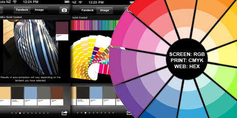
The Colour Wheel and Iphone colour selecting application.
“Color plays a vitally important role in the world in which we live. Colour can sway thinking, change actions, and cause reactions. It can irritate or soothe your eyes, raise your blood pressure or suppress your appetite.” www.colourmatters.com
It is harder now than ever to set a brand or product apart in the overly saturated consumer market. This makes correct appropriation of colour vital to the success of a brands identity. Selecting a simple and concise colour palette can ensure your products and services are consistent and have cut-through. You also have to think about the applications in print, digital and web as colour standards and approaches differ.
RGB colour format for graphic reproduction on monitors such as the one you are looking at right now. Red, Green, and Blue are "additive colours". If we combine red, green and blue light you will get white light.
CMYK format is for print reproduction. Cyan, Magenta and Yellow are "subtractive colors". When printing cyan, magenta and yellow inks on white paper, they absorb the light shining on the page. In practice, printing subtractive inks may contain impurities that prevent them from absorbing light perfectly. In order to get decent dark colors, black ink is added in increasing proportions, as the color gets darker and darker. This is the "K" component in CMYK printing. "K" is used to indicate black instead of a "B" to avoid possible confusion over Blue ink.
Hexadecimal format is for web application. The specific colour is created using a code that represents the values of that colour. Hexadecimal numbers are "natural" to computers, because computers store and handle binary digits, and four binary digits make one hexadecimal digit. Two Hexadecimal digits together (called a "byte" in computer terminology) can represent 16×16=256 different levels of colour.
We recently redeveloped our own brand and created a simple A3 poster which our team can use to drive consistent application amongst our diverse projects and clients. This provides specifications and a helicopter guide good enough for 90% of applications.
We deal with alot of start-up business and products where a brand has to be created along with a requisite colour scheme. It is at this point that employing basic colour theory principles can eliminate some of the issues of poor selection. Employing colour theory principles throughout your workflow can also ensure you will consistently combine colours together perfectly every timeThe Colour Wheel
If you follow the principles of the Colour Theory, then the following colours are harmonious. Here are some simple tips which you can use with the generic colour wheel
(see above image)
When developing a colour palette for a new brand/project, investigate the themes and messages that identify with its consumer or target audience. Understanding how colour is going to influence the way your design is perceived is the first step to harnessing its effect.
There are a variety of tools online you can explore in order to develop these concepts. www.colourlovers.com has a keyword search tool that enables to you input a theme and browse a range of palettes for inspiration. The gallery in www.kolur.com works with different palettes to spark a visual response to develop a range of palette options. http://bit.ly/hGxJdr explains the effect of colour on the viewer and their emotional response.
Try exploring the environment with the Pantone Itunes application http://bit.ly/dFNbp1. Take a photograph of something which has the colour combinations you want and it automatically creates a detailed palette with Pantone, CMYK and RGB colour values. Resene paints have also got an effective Iphone application based on their colour range (see above image for an example of this).
If you aren’t up-to-date with the latest mobile technology then http://bit.ly/i3BhfO has created a range of palettes from nature with the specific colour values outlined from the selection.
Investigate the theme of a chosen project and create a collection of images to reference. Try opening these images and selecting colour values with the eye-dropper tool. These individual colours will also offer a range of complimentary colours and tints to work with from the initial colour selection.
Although the vast array of tools both online and in Adobe Creative Suite software for developing colour palettes can satisfy a designers lean turn-around times, production considerations should be considered and physical proofs signed off before committing to any colour palette. So ultimately you need to document your standards and specifications in a simple way that people can use and follow. A 100 page manual is too hard for most to comprehend try something simple with the most common aspects and uses.
Comments
Post new comment